

A notebook is judged in seconds by the material in your hand, the texture under your thumb, and the way it opens on a desk. Surprisingly, none of that has to do with what is printed on the cover.
This guide focuses purely on the tactile and visual choices that elevate custom notebook design: material, texture, binding, finishing, layout, and the small details that tie it all together. If you want to source customized notebooks in bulk that clients will actually keep, here are the 10 most critical design decisions you need to make.
TABLE OF CONTENT
- Choosing a Cover Material That Sets the Tone
- Leveraging Texture for Immediate Impact
- Selecting the Right Binding Structure
- Edge and Corner Details
- Subtle Branding and Finishing Techniques
- Purposeful Interior Layout Choices
- Mixing Paper Stocks and Colors
- The Psychology of Color Selection
- Small Accessories That Finish the Design
- Bringing It All Together with Restraint
- Frequently Asked Questions (FAQs)
1. Choosing a Cover Material That Sets the Tone
Cover material does most of the heavy lifting before a client even opens the notebook. Paper, cloth, felt, and vegan leather each send a very different signal.
- A hard leather cover reads as structured, executive, and premium.
- A cloth or felt finish feels casual, creative, and highly approachable.
The right starting point isn’t simply picking the most expensive option; it is choosing whichever material perfectly matches the mood your corporate notebook is meant to convey.
2. Leveraging Texture for Immediate Impact
Texture is where a good material becomes a memorable one. A textured surface, such as a cross-hatched linen finish or natural full-grain leather, catches the light differently than a flat surface and invites touch.
Adding texture is also one of the most cost-effective ways to elevate a custom notebook design, as it enhances the existing base material rather than replacing it with something more expensive.
3. Selecting the Right Binding Structure
Binding is frequently treated as a purely functional choice, but it is just as visible as the cover itself.
- Saddle Stitching: Keeps a slim, simple profile suited for smaller, low-page-count notebooks.
- Spiral or Wire Binding: Lets the pages lie completely flat, a detail users notice the moment they start writing during a seminar.
- Singer-Sewn (Thread-Bound): Turns the spine into a visible design element through the use of contrasting colored thread.
4. Edge and Corner Details
Corner and edge details finish the job.
- Rounded corners soften the notebook’s overall shape and reduce wear and tear over time as it is pulled in and out of laptop bags.
- Reinforced metal edges add a quiet sense of durability and vintage quality.
These are small, inexpensive manufacturing touches, but they are exactly what separates a considered, premium notebook from a generic catalog item.
5. Subtle Branding and Finishing Techniques
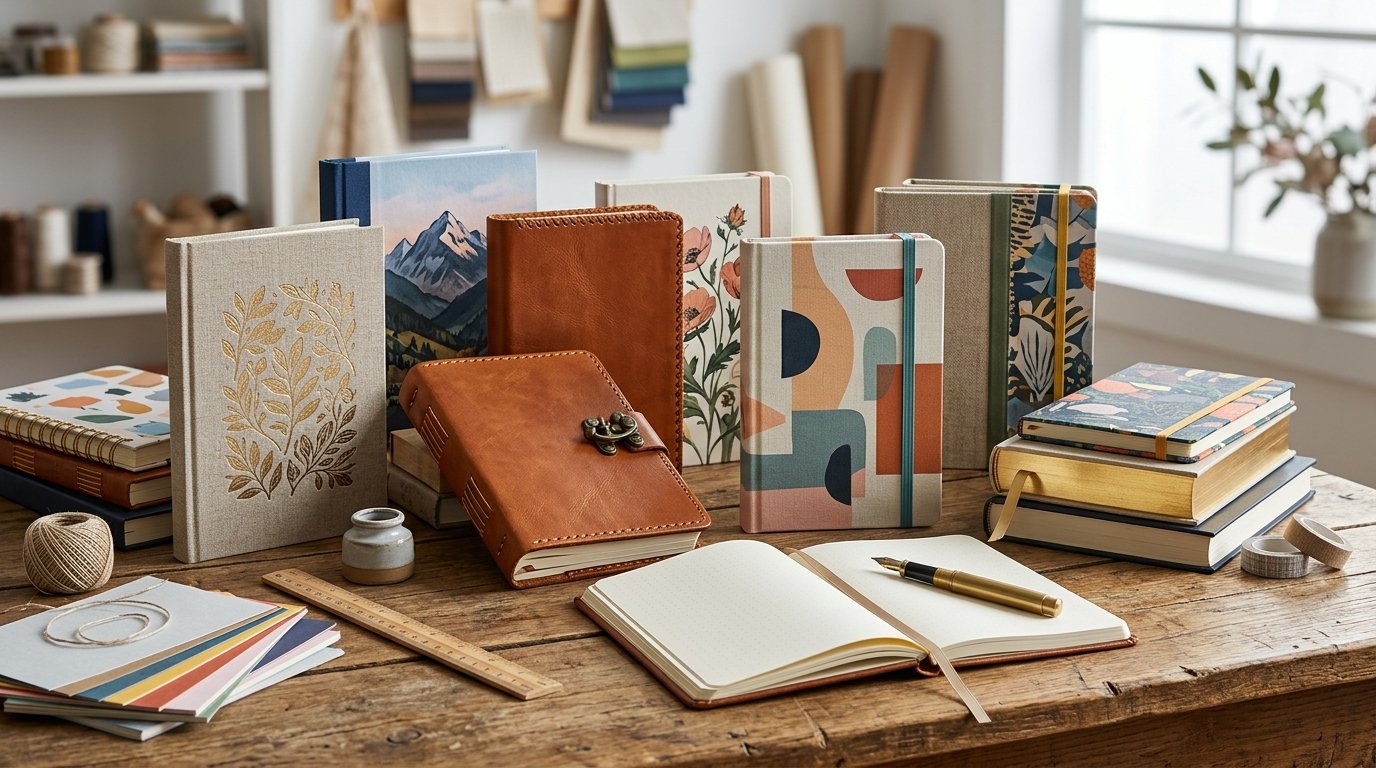
Finishing techniques like foil stamping, blind embossing, and debossing add incredible depth to a cover without altering its underlying material.
The exact same technique can look entirely different depending on the surface—gold foil on leather catches the light much differently than foil on matte paper. Used with restraint, these techniques create a sense of executive craftsmanship. Used excessively, they make a clean design feel cluttered and cheap.
6. Purposeful Interior Layout Choices
What is inside the cover deserves just as much attention as what is on it. The page layout directly shapes how a notebook gets used:
- Dot-Grid Pages: Feel flexible and modern (ideal for tech startups and designers).
- Blank Pages: Feel minimal and premium (perfect for sketching or mind-mapping).
- Ruled Pages: Feel classic and familiar (best for standard meeting notes).
7. Mixing Paper Stocks and Colors
Combining paper stocks or colors within a single notebook is a highly subtle layout choice that adds visual interest without cluttering the cover. Inserting a colored heavy-stock section to mark a new chapter, or using a different paper texture for a dedicated planner section, gives a notebook far more personality than a uniform block of identical pages.
8. The Psychology of Color Selection
Color carries significantly more signaling weight than most corporate buyers realize.
- Muted, earthy tones (navy, forest green, tan) tend to read as professional, stable, and premium.
- Bright, saturated colors (yellow, bright red) read as casual, energetic, and highly creative.
Choosing a color deliberately based on how and where the notebook will actually be used matters far more than blindly chasing a temporary design trend.
9. Small Accessories That Finish the Design
Small functional accessories are the last, easiest-to-underestimate layer of custom notebook design.
- An elastic closure band keeps loose documents secure.
- A ribbon bookmark allows for fast page navigation.
- A built-in pen loop ensures a writing tool is always at hand.
None of these are expensive additions to a bulk manufacturing order, but their absence is often what makes an otherwise well-made notebook feel frustratingly incomplete.
10. Bringing It All Together with Restraint
Standing out isn’t about adding more logos it is about making deliberate, restrained choices at every layer, from the vegan leather in your hand to the thread along the spine.
Each choice is small on its own, but together, they decide whether a notebook ends up in the trash or permanently stays on a CEO’s desk.
If you are working on a custom notebook design and want to talk through premium materials, custom binding, or debossed finishing options, get in touch with PUP Exports today. As direct B2B manufacturers in India, we are happy to help you bring your exact corporate vision to life.